


 New
New


 Play QuickTime version
  Play Flash version
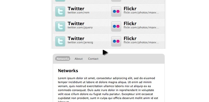
Watch
Watch jQuery look: Tim Van Damme screencast (Alternative flash version)
QuickTime version is approximately 60Mb, flash version is streaming.
View the demo used in the screencast
Deconstructing the effects
The first thing we need to do is look at the site in a WebKit browser (Safari’s my poison) and in a non-WebKit (Firefox will do), then view the page with JavaScript turned off, then look at the URLs and see the effect of landing on the page with the hash in the URL.
Hover shift
The roll over effect on the li elements (Twitter, Delicious, etc) shift softly to the left in WebKit. In Firefox they jump.
If you look at the stylesheet you’ll see this is being achieved with CSS transitions:
#networks li a img {
    float: left;
    margin: 0 10px 0 15px;
    -webkit-transition: margin-left 0.25s linear;
}

#networks li a:hover img {
    margin-left: 10px;
}
I’m a big fan of Progressive Enrichment, but there’s still an argument for matching functionality across browsers (government funded projects for instance) – so let’s look at doing this in jQuery so that all browser have the same functionality.
There’s actually two aspects we need to recreate using jQuery:
- Animated margin-left
- Background rgba crossfade (to create a darkened effect)
Animated margin-left
This is relatively simple. Tim’s site is floating the icon to the left, so the text rests against it. So when you hover over the link, the margin-left is reduced to 5px from 10px.
$('a').hover(function () {
  $('img', this).stop().animate({
    marginLeft : 5
  }, 250);
}, function () {
  $('img', this).stop().animate({
    marginLeft : 10
  }, 250);
});
This code triggers when the user hovers over the anchor element and animates the margin-left over 250ms.
We include the .stop() function to prevent the animation from continuously firing (give it a try without the .stop to see the effect).
However! We want the effect to still work without JavaScript enabled, so the following CSS is in place:
a:hover img {
  margin-left: 5px;
}
The problem now is that when we roll the mouse over the anchor element for the first time it jumps to the left. Subsequent times it doesn’t jump. This is because an inline style is being applied.
To fix this we can apply the default margin-left manually (this is a nasty work around, but does the trick for this effect):
$('a').hover(fn1, fn2).css('marginLeft', 10);Where fn1 and fn2 are the functions defined earlier.
Recreating rgba
Next up is recreating the rgba CSS3 effect. rgba is background colour with alpha transparency as the fourth parameter, e.g.:
background: rgba(164, 173, 183, .15);I will be the first one to point out that this is a rather extreme approach to achieving this effect, and I would in all cases fight to use plain CSS to achieve this effect.
However, in the name of education – let’s see how we can create this effect.
We will need a block div that sits within the anchor element, using position: absolute and filling the area being the link. We can’t simply change the opacity of the background as this will change the opacity of the entire DOM fragment.
When the user hovers over the anchor element, we will fade the opacity up and down between 0 and 0.15.
// insert the rgba fader element
$('a').each(function () {
  $('<div class="fader" />').prependTo(this);
})... // chain the hover functions
We style the element as:
.fader {
  opacity: 0;
  -moz-opacity: 0;
  filter:alpha(opacity=0);
  position: absolute;
  top: 0;
  left: 0;
  width: 100%;
  height: 60px; /* because IE6 isn't listen to 100% */
  background-color: #A4ADB7;
}
I also noticed a problem in IE6, similar to the jumping margin – where the background become solid the first time and then fades correctly. So I’ve changed the prepend to set the opacity at the same time.
$('<div class="fader" />').css('opacity', 0).prependTo(this);Now we include the fake rgba element fading in the hover function:
.hover(function () {
  $('img', this).stop().animate({
    marginLeft : 5
  }, 250);

  $('.fader', this).stop().animate({
    opacity : 0.15
  });
}, function () {
  $('img', this).stop().animate({
    marginLeft : 10
  }, 250);

  $('.fader', this).stop().animate({
    opacity : 0
  });
});
This completes the hover effect.
Accordion bounce
Accordion bounce is just a name I’ve made up. The effect is an accordion, but since it’s dropping down and up again, I’m saying it bounces!
If you look carefully when tabbing between the panels not only does the panel slide up and down, but it also fades out as it’s sliding up.
Also if you play with Tim’s version and click many tabs the slide effect goes a little haywire – which is where the .stop() method is required. However, there’s also a small jump that happens when switching from the ‘contact’ to the ‘about’. This is because the slideDown method uses the last height that it was before a call to slideUp. In this demonstration, I’m going to try to prevent both of the subtle issues.
Markup
The markup for my example is your basic ul + div combo that you’ll see in any traditional tab markup pattern.
<div>
  <ul>...</ul>
  <div class="panels">
    <div id="a">...</div>
    <div id="b">...</div>
    <div id="c">...</div>
  </div>
</div>
jQuery
I’ve written the code so that it’s the beginnings of a plugin and can be dropped in to any web site with a small tweak in the code here and here.
Our animation requires the following steps to work:
- Clicking on any navigation link will trigger the animation
- If the link is already selected, we’ll ignore the animation
- Remove the selected class from the navigation and add it to the currently clicked link
- If the browser supports opacity, fade the panels out†
- Slide the panel container up
- Once the slide up is finished, show the select panel, and slide down
- Finally, when the page has loaded, if a hash is on the URL, show that panel or show the first panel
† This is because IE6′s cleartype issue causes the text to look rather nasty when animating.
Setup
There’s a number of items we need to capture at the beginning of our code to create the effect.
// as we're creating the beginnings of a plugin - let's start with .each
$('.navigation').each(function () {
  var $links = $(this).find('a'), // collect the links

    // run through the link's hash and create #network,#about,#contact
    panelIds = $links.map(function() { return this.hash; }).get().join(","),

    // now grab a jQuery instance of these elements, i.e. the 3 panels
    $panels = $(panelIds),

    // look for the wrapping element and cache it
    $panelwrapper = $panels.filter(':first').parent(),

    // animation delay, so everything runs together
    delay = 500,

    /* animation height offset - required to avoid the jumping
       we could/should calculate this by adding following from $panelwrapper:
        o margin-top
        o margin-bottom
        o padding-top
        o padding-bottom
    */
    heightOffset = 40;

  // hide all the panels initially
  $panels.hide();

  // TODO add click handler code
});
The line:
panelIds = $links.map(function() { return this.hash; }).get().join(","),Is using the map function to loop through all the navigation links, and return a jQuery object containing only the ids of the anchors. By calling .get().join(',') it returns a CSV of ids, which we can then use as a selector. This is the equivalent to:
$panels = $('#networks, #about, #contact');Click handler
The click handler code is where all the animation happens, and we have to tick our list off from above.
$links.click(function () {
  // cache a copy of the DOM element, and jQueryifed element
  var link = this,
    $link = $(this);

  // (2) If the link is already selected, we'll ignore the animation
  if ($link.is('.selected')) {
    return false;
  }

  // (3) Remove the selected class from the navigation and add it to
  // the currently clicked link
  $links.removeClass('selected');
  $link.addClass('selected');

  // a nice touch from Tim's version, change the document title,
  // this could use link.title if we wanted to show something different
  document.title = 'jQuery look: Tim Van Damme - ' + $link.text();

  // (4) If the browser supports opacity, fade the panels out
  if ($.support.opacity) {
    $panels.stop().animate({opacity: 0 }, delay);
  }

  // Slide the panel container up, we're using animate to avoid jumping issues
  $panelwrapper.stop().animate({
    height: 0
  }, delay, function () {
    var height = $panels.hide() // hide all panels again
      .filter(link.hash) // narrow down to this, e.g. #contact
        .css('opacity', 1) // reset the opacity (from step 4)
        .show() // reset the display prop (also from step 4)
        .height() + heightOffset; // return and store the height to animate to

    // (6) Once the slide up is finished, show the select panel, and slide down
    $panelwrapper.animate({
      height: height
    }, delay);
  });
});
Auto-selection
The final task to support hashes on the URL (step 7 above). So we add the following code below the click handler:
// if there is a hash on the url, filter the links by the hash prop
var toshow = window.location.hash ? '[hash=' + window.location.hash + ']' : ':first';
// now filter the links by the selector, and trigger a click.
$links.filter(toshow).click();
You can view the final working version from this tutorial and the screencast
You should follow me on Twitter here I tweet about jQuery amongst the usual tweet-splurges!